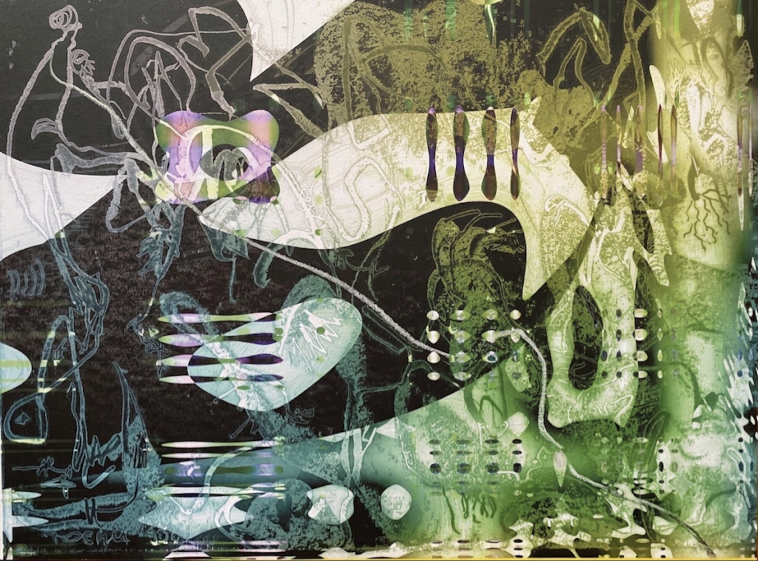
Cell (No. 05)
- Title: Cell
- Series: Aperture Set 1
- Artist: ZT Tosha
- Medium: Fine art print on Hahnemühle Photo Rag paper (40×30 cm), with watercolor and cut-out interventions, and a single diagonal line drawn in white wax crayon; mounted on white mat paper and board; framed in black profile (50×40 cm).
- Year: 2026
Critical Overview: The Biology of the Fragile
If Looking for the Right Angle (No. 03) introduced the cycle’s first act of violence, and Occlusion (No. 04) introduced concealment, then Cell (No. 05) represents a radical shift in temperament. It is the Aperture cycle’s most delicate, organic, and luminous entry—a biological oasis amidst the industrial chaos of the surrounding works.
The title is deliberately scientific, evoking the foundational unit of life: the cell. Yet, the artwork does not present a clinical diagram; it presents a fluid, shifting landscape of translucent color, organic morphology, and precarious balance.
Materiality: The Luminous Void
The foundational surface of Cell is a deep, absorbent charcoal black—a void that anchors the composition and provides a gravitational field for the lighter elements. Against this dark ground, the artist has applied translucent watercolor washes in pale jade greens, minty whites, and ghostly lilacs.
These watercolor layers are not opaque; they are glazed and semi-transparent, allowing the black void to bleed through. This creates a luminous, phosphorescent effect, as though the green and lilac forms are glowing from within the darkness. The color palette evokes the aesthetic of bioluminescent deep-sea organisms, microscopic cellular structures, or the soft glow of a lunar eclipse.
The Cut-Out Interventions: The Violation of the Organic
Interrupting the fluid watercolor landscape are several physical cut-outs:
- Top Left: A large, scalloped white shape, cut from the paper, intrudes into the composition like a cloud or an alien membrane.
- Center: A sweeping white curve, punctuated by four dark, teardrop-shaped slits, creates a rhythmic, almost segmented structure—evoking a biological spine or a series of unblinking eyes.
- Lower Left: A cluster of white cut-outs, arranged in radiating, finger-like stripes, suggests the tentacles of a sea creature or the spread of a root system.
These cut-outs are not random; they are surgical interventions that expose the pristine white backing of the mat beneath. They create a stark contrast between the organic, fluid watercolor and the rigid, geometric edges of the cut paper. The white forms do not blend; they intrude, asserting their presence against the fragile watercolor washes.
The Diagonal Wax Line: The Minimal Gesture
Spanning across the entire composition is a single, thin diagonal line drawn in white wax crayon. This line runs from the upper-left quadrant, passing through the central cut-out, and descending toward the lower-right.
This line is the conceptual anchor of the piece. It is a minimal, almost silent gesture—a deliberate mark that does not follow the organic curves of the watercolor, nor the geometric edges of the cut-outs. It cuts across the composition with an unapologetic simplicity, acting as a thread of consciousness or a timeline that binds the scattered fragments together.
The choice of wax crayon is significant. Unlike ink, which absorbs into the paper, wax sits on top of the surface, creating a subtle physical ridge. Under directional light, this ridge catches the illumination, causing the white line to glow faintly against the dark background.
The Framing Strategy: The White Mat as a Clinical Containment
As with the entire Aperture series, Cell is presented within a crisp white mat and a uniform 50×40 cm black frame.
The white mat is conceptually critical to this piece. Because the watercolor washes are delicate, translucent, and prone to bleeding, the mat provides a sterile, clinical container that isolates the organic forms and prevents them from dissolving into the wall. It transforms the fluid, biological landscape into a preserved specimen—a cellular sample pinned and displayed under laboratory glass.
Critical Honesty: The Fragility of the Translucent Surface
A rigorous curatorial assessment must acknowledge the inherent fragility of this piece.
The watercolor washes are applied in thin, delicate layers. They are susceptible to fading, moisture damage, and physical abrasion. Furthermore, the white wax crayon line, while visually powerful, is physically vulnerable to smudging or displacement if the surface is touched.
For Cell to achieve its full curatorial potential within a museum context, it is non-negotiable that the framing incorporates museum-grade, UV-filtering anti-reflective glass. This glass will not only protect the fragile watercolor from environmental damage, but will also eliminate glare, allowing the viewer to appreciate the full depth of the translucency and the subtle physical ridge of the wax line.
The Role of the Piece in the Series (No. 05)
Positioned as No. 05 within the Aperture cycle, Cell serves as a critical breathing space. It follows the dense, blocked obscuration of Occlusion (No. 04) and precedes the heavy, metallic industrialism of Tailoring (No. 07).
It is the only piece in the series that embraces organic fragility over industrial aggression. While other works tear, scratch, and layer, Cell whispers. It reminds the viewer that the Aperture cycle is not merely a study in violence and decay, but also a meditation on growth, bioluminescence, and the precarious beauty of organic life.
Conclusion: The Quiet Revolution
Cell is a work of remarkable restraint and luminous beauty. It does not demand attention through aggression or density; it invites the viewer to look closely, to peer into the translucent depths, and to engage with the subtle interplay of light, color, and physical cut-out.
The pale watercolor washes, the rhythmic cut-outs, and the single, diagonal wax line combine to create a composition that is simultaneously fragile and decisive. It is a work that celebrates the cellular, the biological, and the luminous—a quiet, glowing testament to the vitality that underlies the cycle’s more aggressive interventions.
Acquisition Recommendation: Accepted.
Recommended display: Isolated on a neutral white or light-grey wall, illuminated by soft, diffused directional gallery spotlights (700–900 lux). Avoid harsh, direct lighting, which will flatten the translucency of the watercolor. Museum-grade anti-reflective glass is strictly mandatory to protect the delicate washes and preserve the subtle glow of the white wax line.
